
The new version of AQUA-DUCT provides several new tools for macromolecules analysis and modules which facilitates the work flow:
GUI
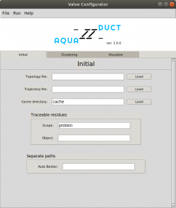
Easy nmode of GUI.
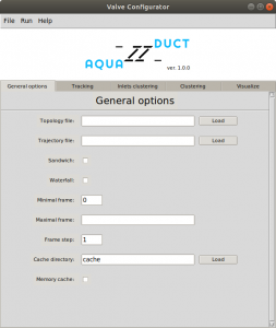
Normal mode of GUI.
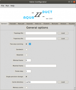
Expert mode of GUI.
Kraken module for data analysis
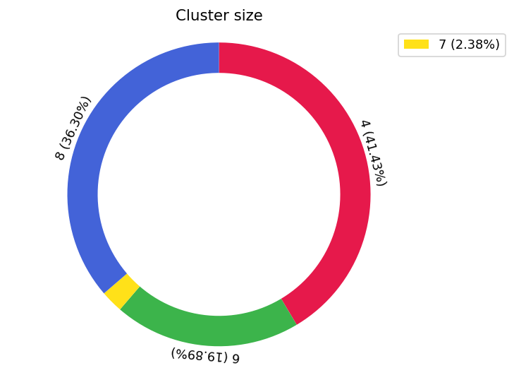
Graphical representation of the cluster size (based on the number of inlets).
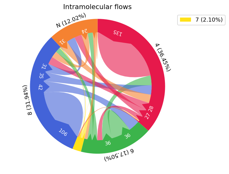
Graphical representation of the flow of solvents between particular clusters.
New tunnels entry representation
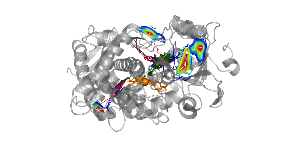
Kernel Density Estimation method can be used to visualize the most preferable location of the molecules entrance/exits.
Automatic hot-spots detection
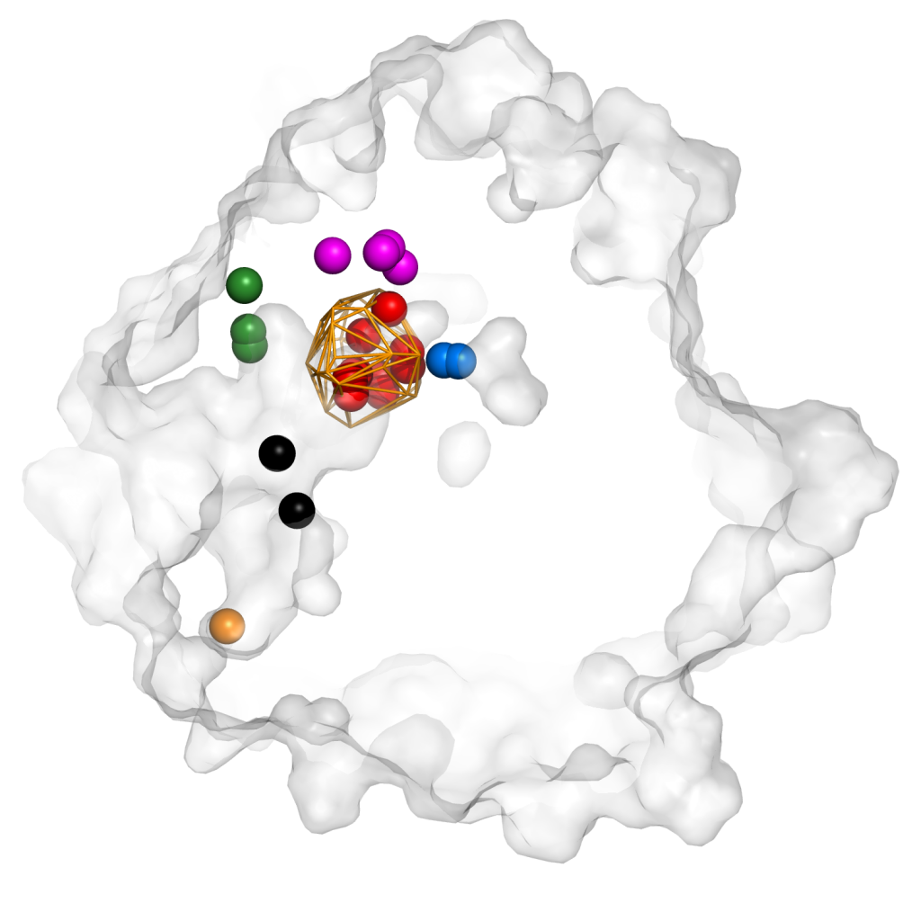
An example of identified hot-spots by AQUA-DUCT in epoxide hydrolase. Hot-spots are presented as balls and were identified in: active site (red), cavity I (blue), cavity II (cyan), entry to tunnel TC/M (green), entry to tunnel TM2 (orange) and in funnel interior (black).
Energy barrier approximation
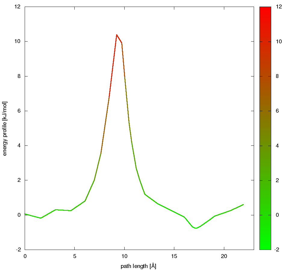
An example of energy profile calculated along pathway linking two different entrances to active site cavity in epoxide hydrolase.
Entry Time Distribution
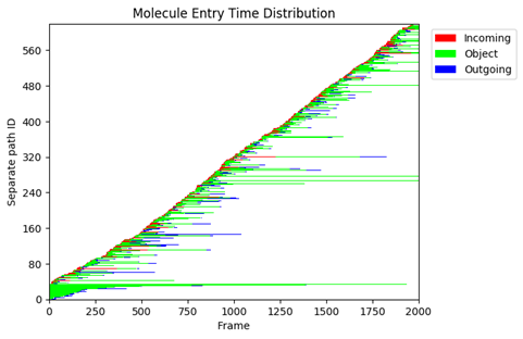
Molecule Entry Time Distribution plot.